Welcome to “Colour Conscious,” our monthly deep dive into the colours that shape our surroundings. Together, we’ll explore how a single hue can transform spaces, define brands, and stir up emotions through thoughtful application and intentional design choices.
The Power of Green
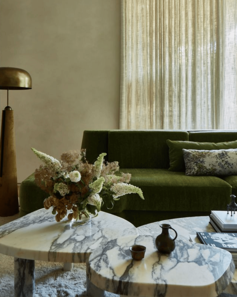
For our debut edition, we’re focusing on green – a colour that masterfully bridges together contrasting ideas. It can be grounding yet uplifting, calming but alive.
Whether expressed through rich forest tones, soft sages, or crisp chartreuse accents, green sets a mood while keeping us tied to the natural world. When used purposefully, it really brings homes and brands to life. Pale greens feel fresh and renewing, like those spring mornings when everything’s starting to bloom again. Meanwhile, deeper greens have this warm, genuine feel with a modern twist – picture aged patina paired with vintage brass hardware, or that earthy matte finish you see on premium print pieces. This versatility makes the colour one of the most compelling in a designer’s palette.
A Few of Duelle Made’s Go-To Greens
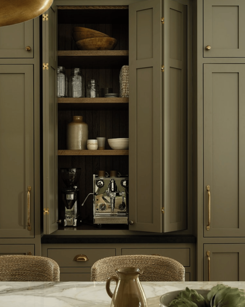
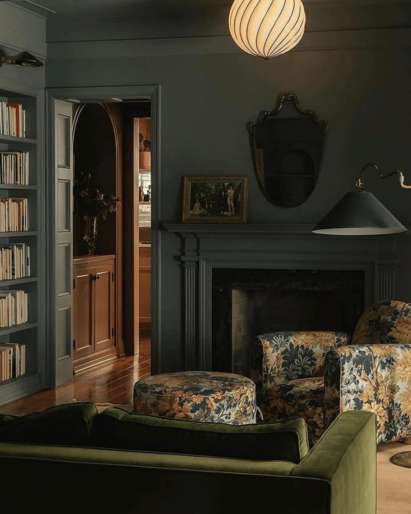
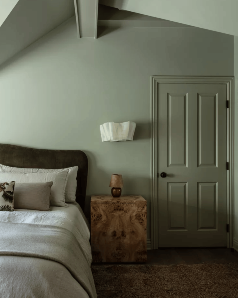
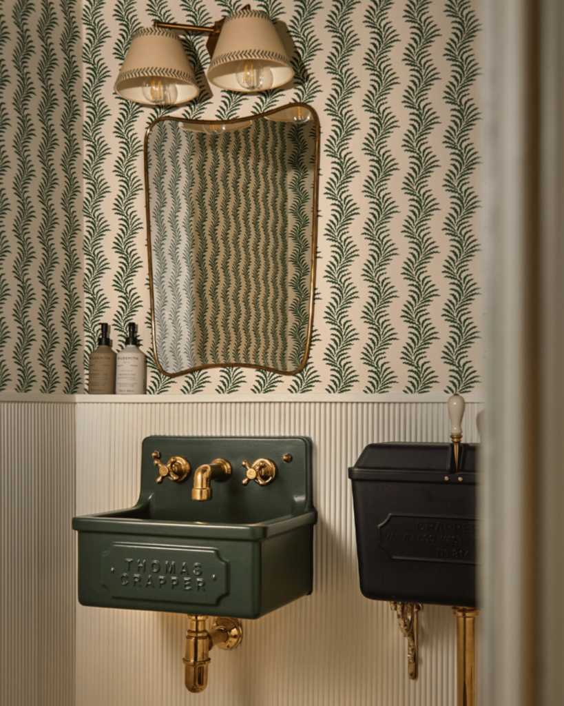
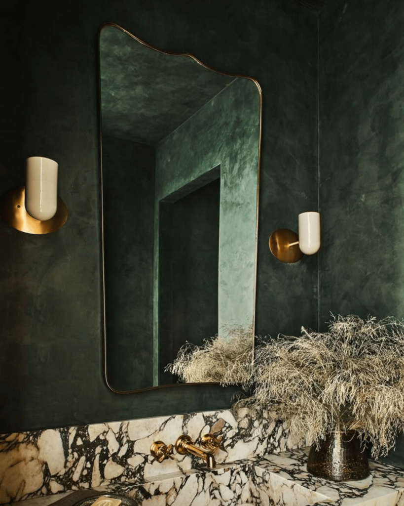
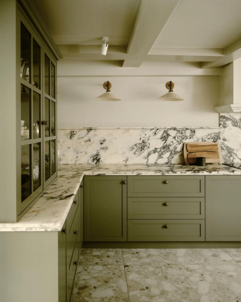
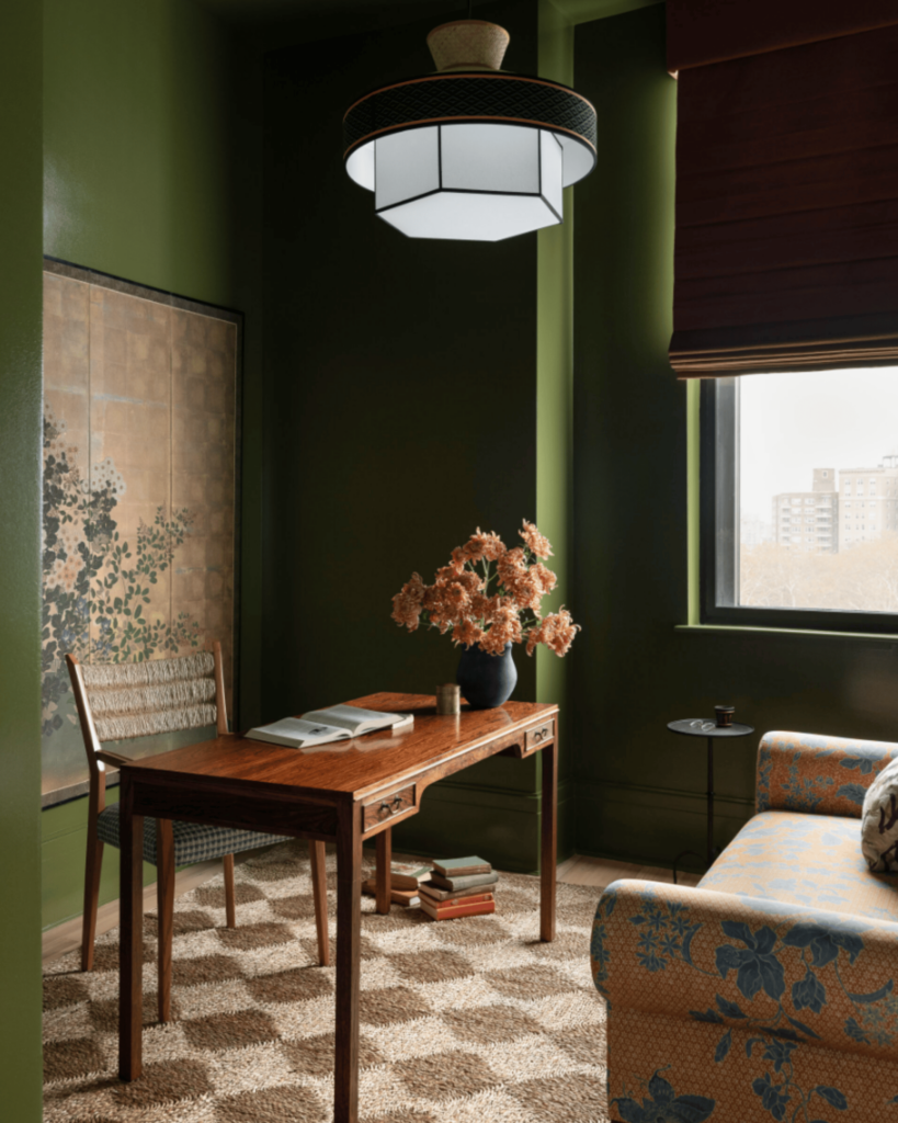
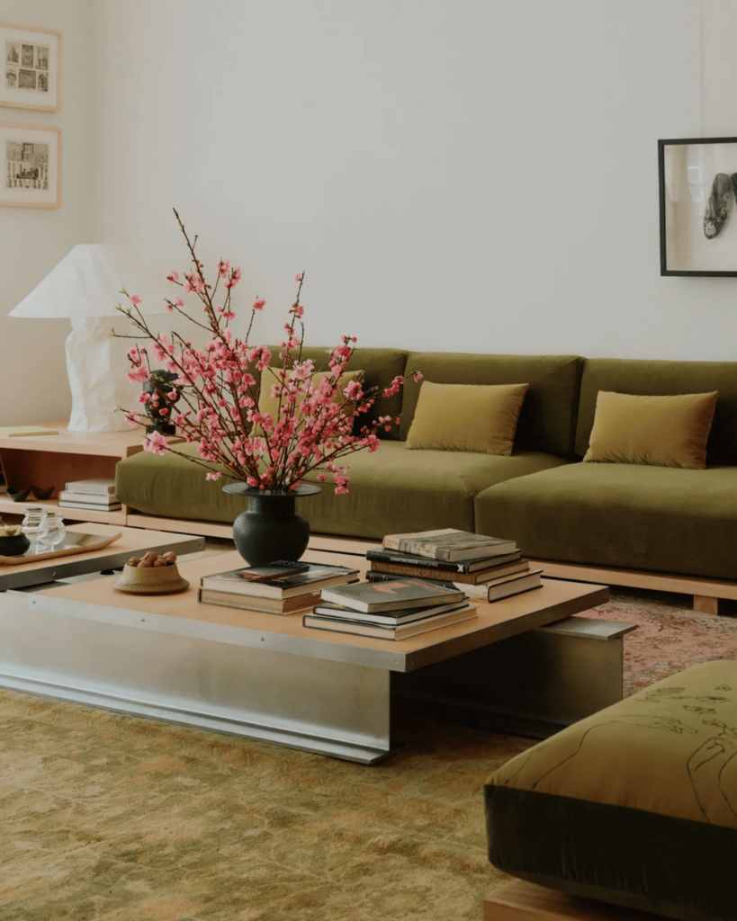
In Interior Design
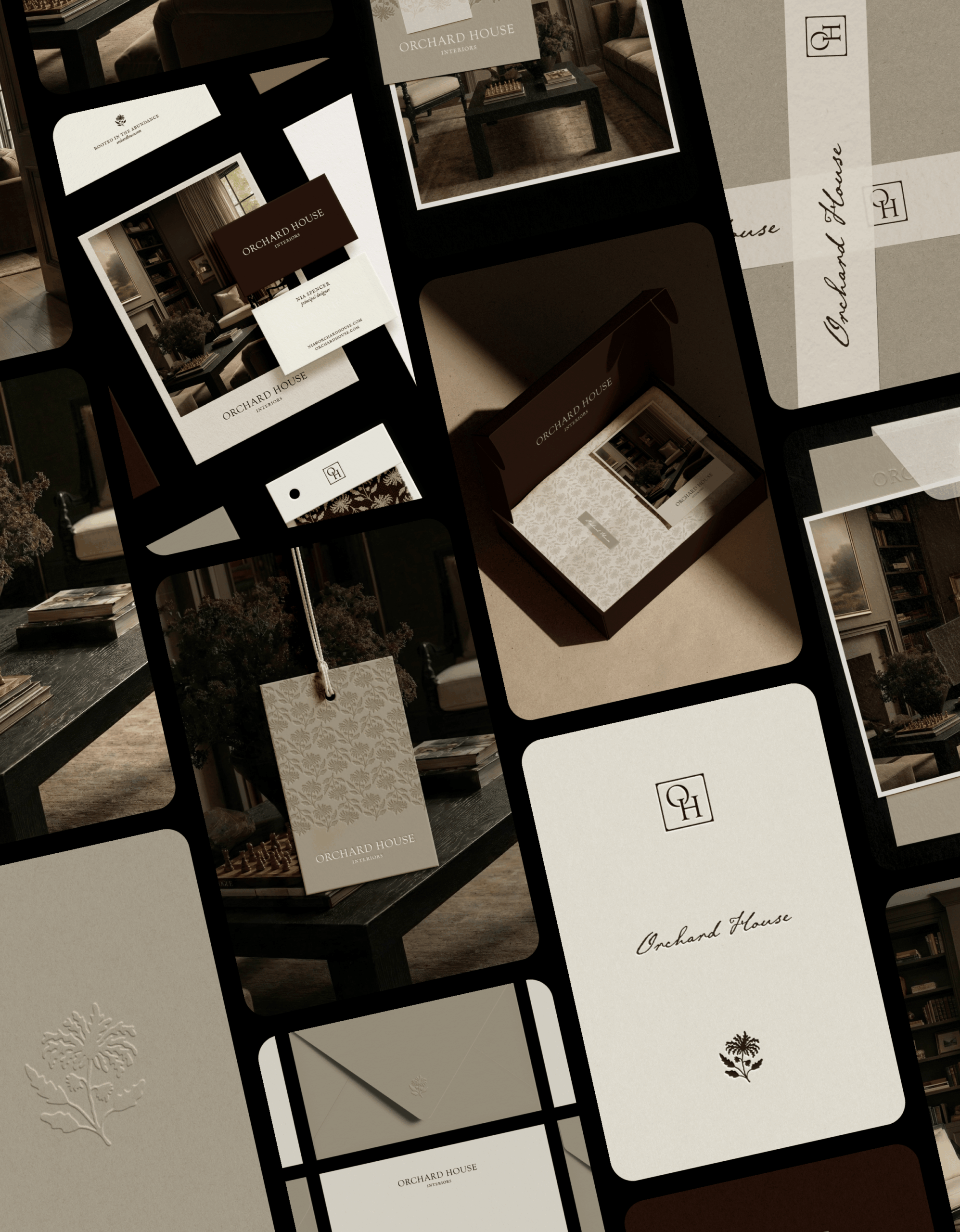
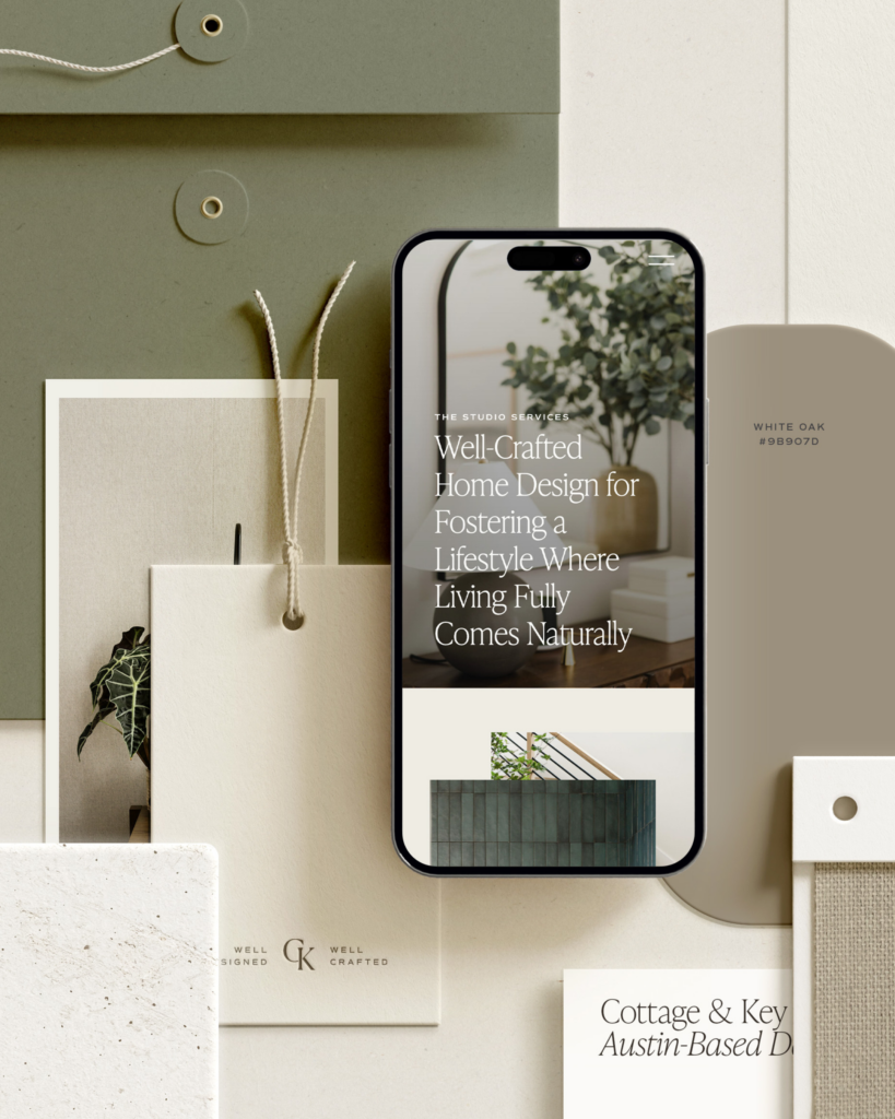
In Our Brands
We’ve harnessed green’s versatility in several brand projects:
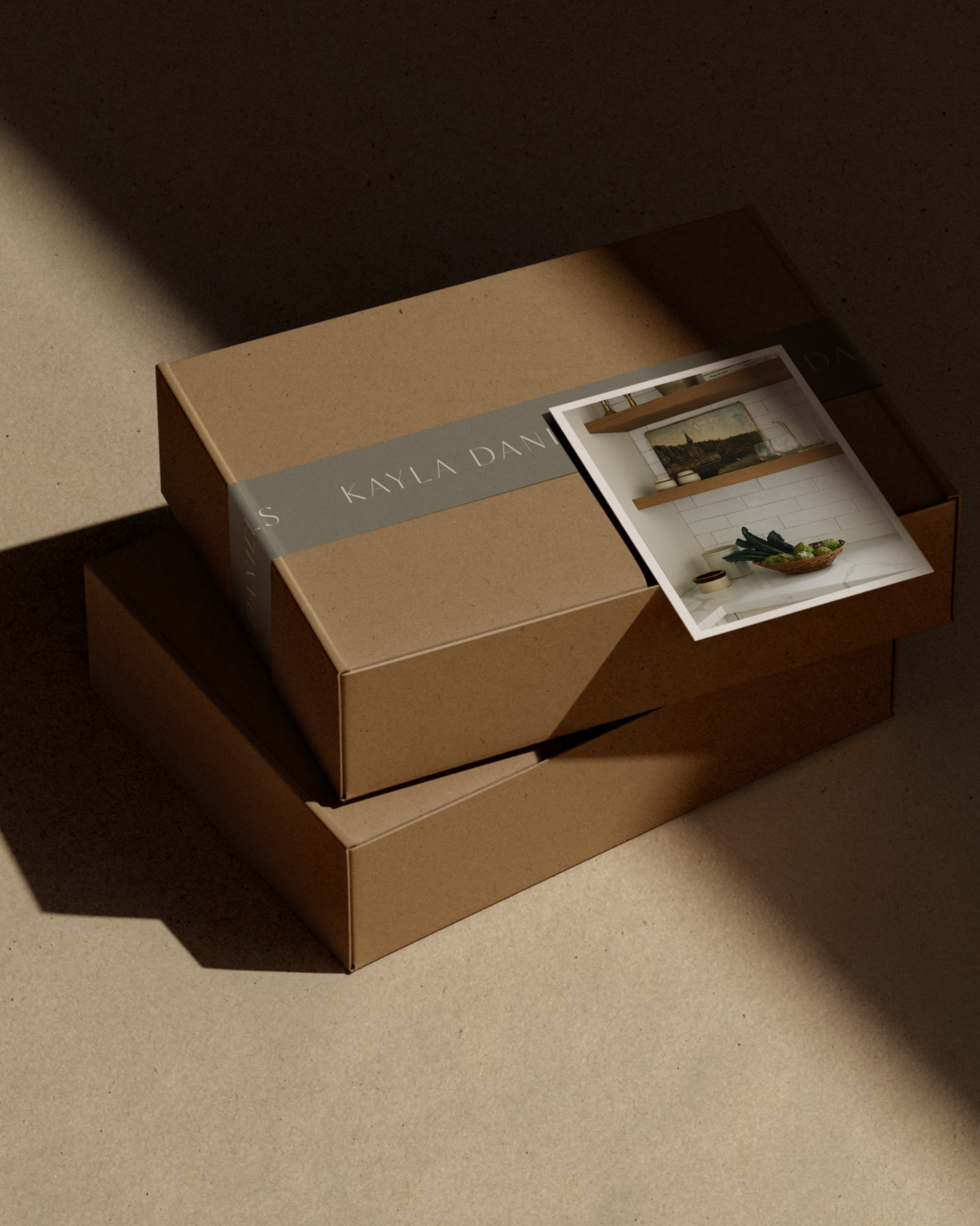
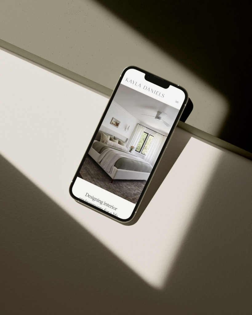
Kayla Daniels Interiors: The brand’s colour palette mirrors the natural environment, embodying Kayla’s commitment to integrating outdoor elements into every project. The calming earth tones inspire feelings of warmth, comfort, and security, which are precisely the emotions her clients desire in their living spaces. Using forest and olive greens as primary brand colours reflects her design philosophy of bringing the outdoors in.
Cottage & Key Design Studio: This brand’s colour palette incorporates serene, refined, sage green tones, aiming to pull you toward feelings of warmth, relaxation, and comfort — qualities that resonate deeply with the studio’s family-oriented clientele. The shade also serves as the foundation for a brand identity that feels both sophisticated and approachable.
Both projects demonstrate the many shades of green and how it can adapt to different brand personalities – while maintaining its core associations with growth, renewal, and natural beauty.
Next month in Colour Conscious: We’ll explore the versatility and sophistication of pink, from muted blush tones to bold magenta statements. Follow along on Instagram @duellemade.