Welcome to “Colour Conscious,” our monthly deep dive into the colours that shape our surroundings. Together, we’ll explore how a single hue can transform spaces, define brands, and stir up emotions through thoughtful application and intentional design choices.
The Power of Blue
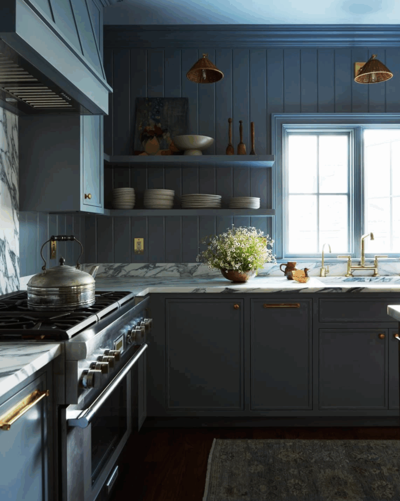
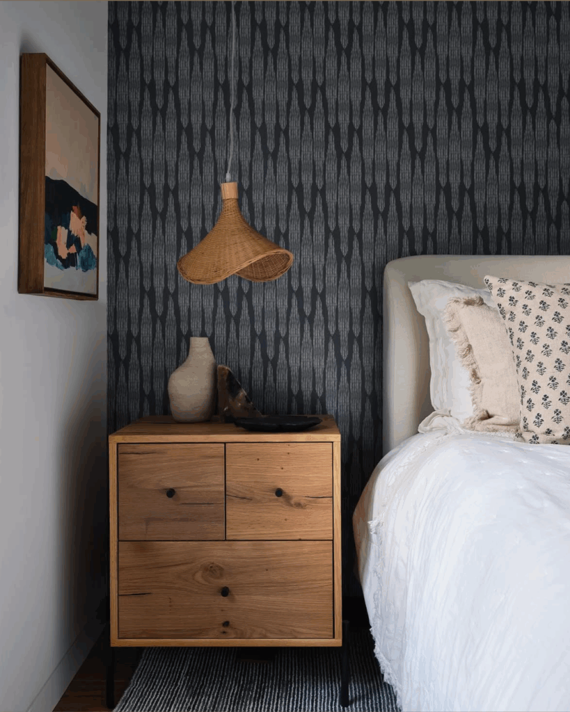
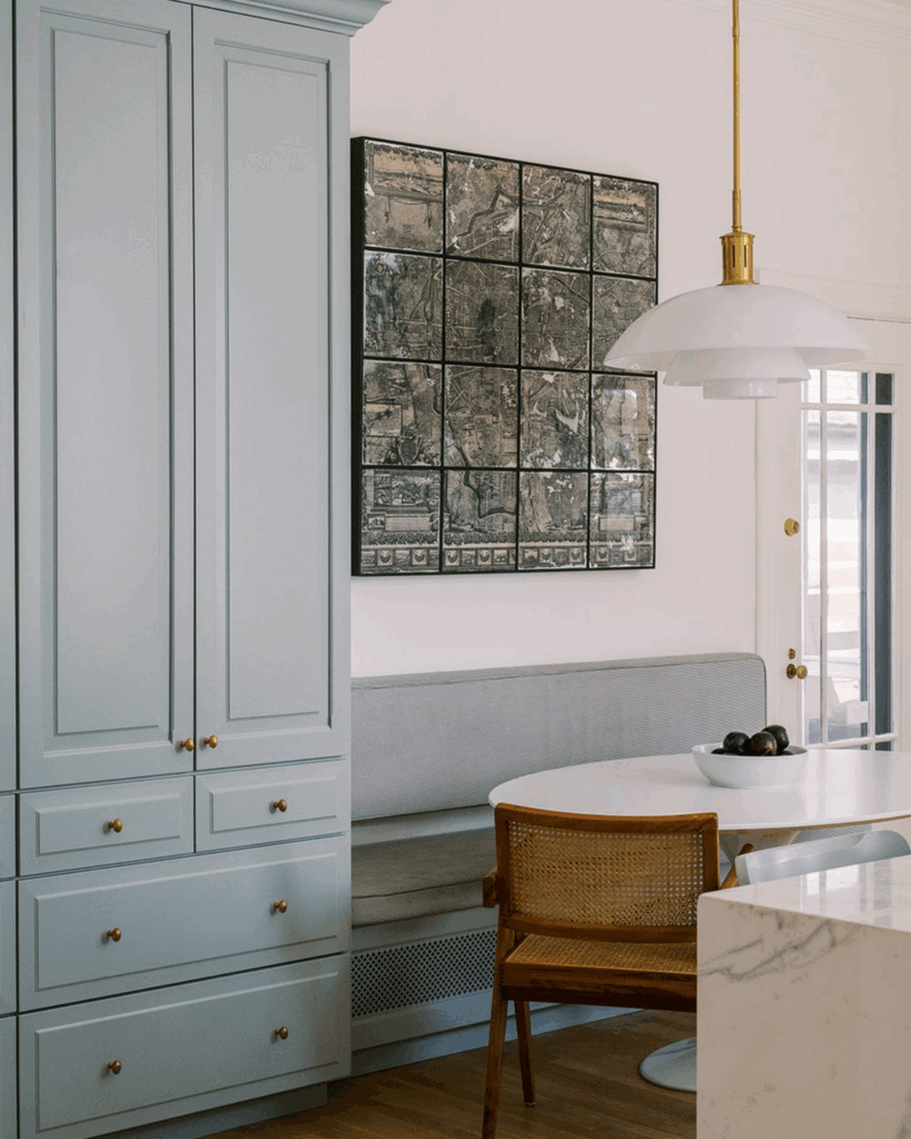
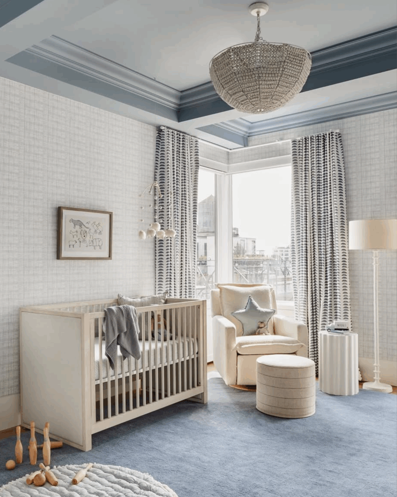
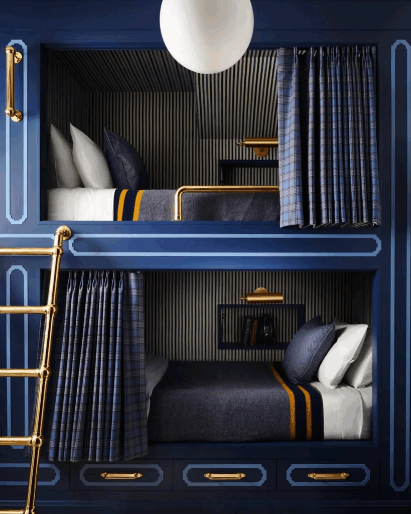
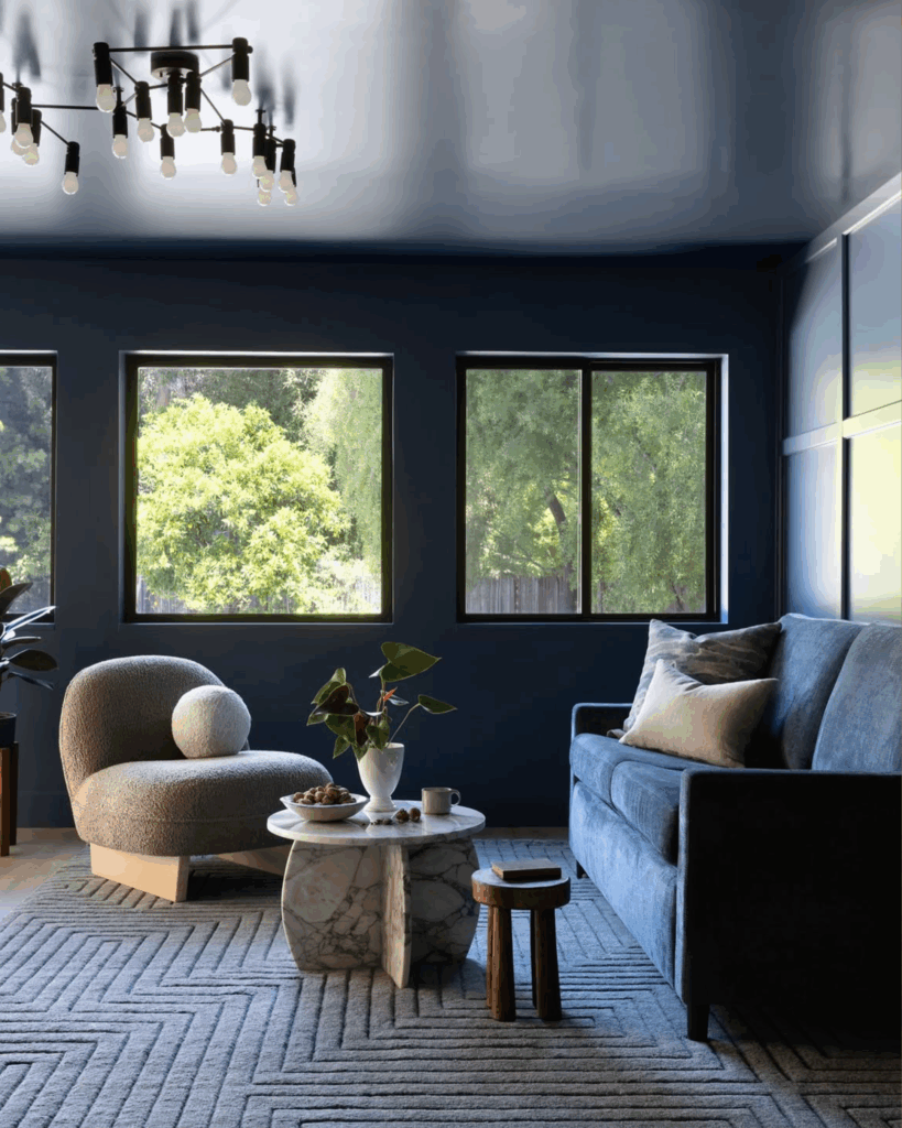
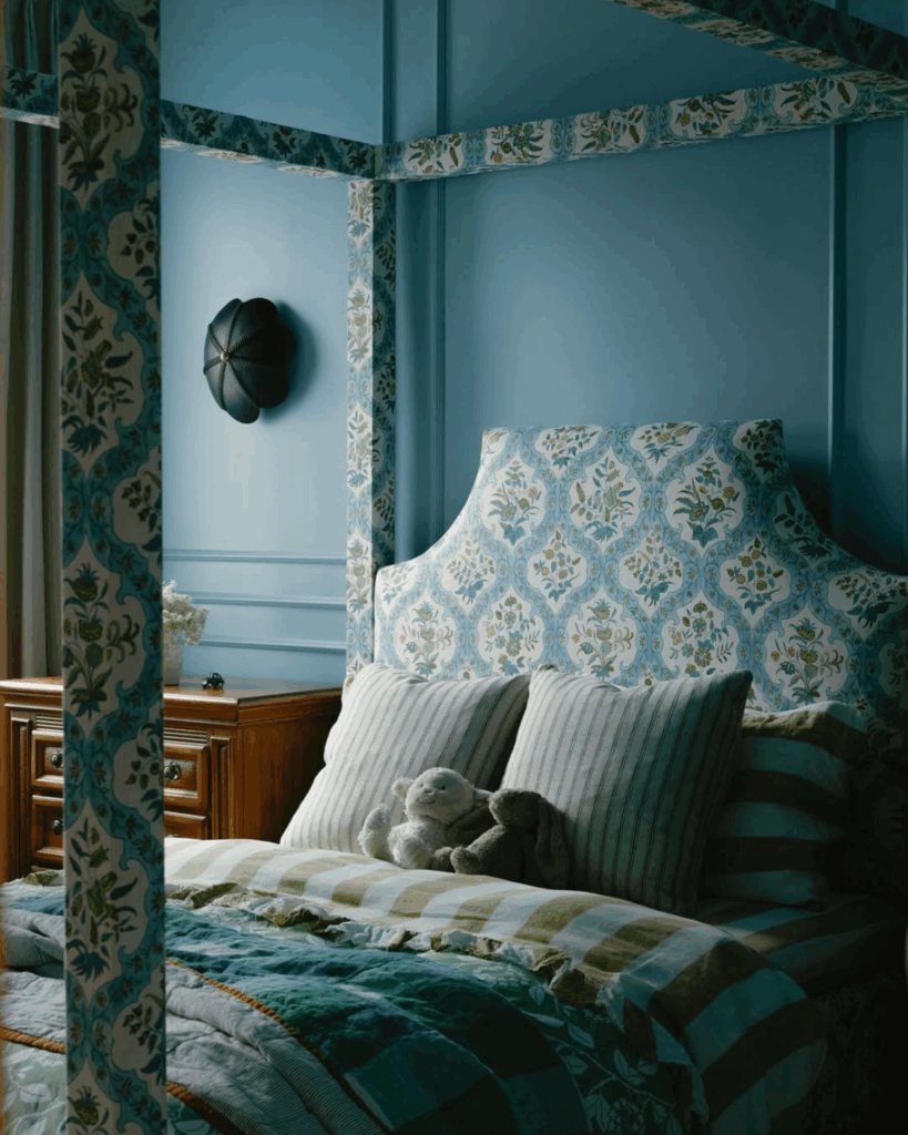
From powder blues to commanding navies, this colour calls to mind feelings of trust, class and order. It regulates in an overstimulating world, ages gracefully in the face of fast trends, and clarifies through steady influence.
In both interiors and branding, soft blues generate lightness and hope, expanding cramped spaces and making brands feel human. Rich blues provide weight and credibility, giving rooms a backbone and telling customers they can trust what you’re selling.
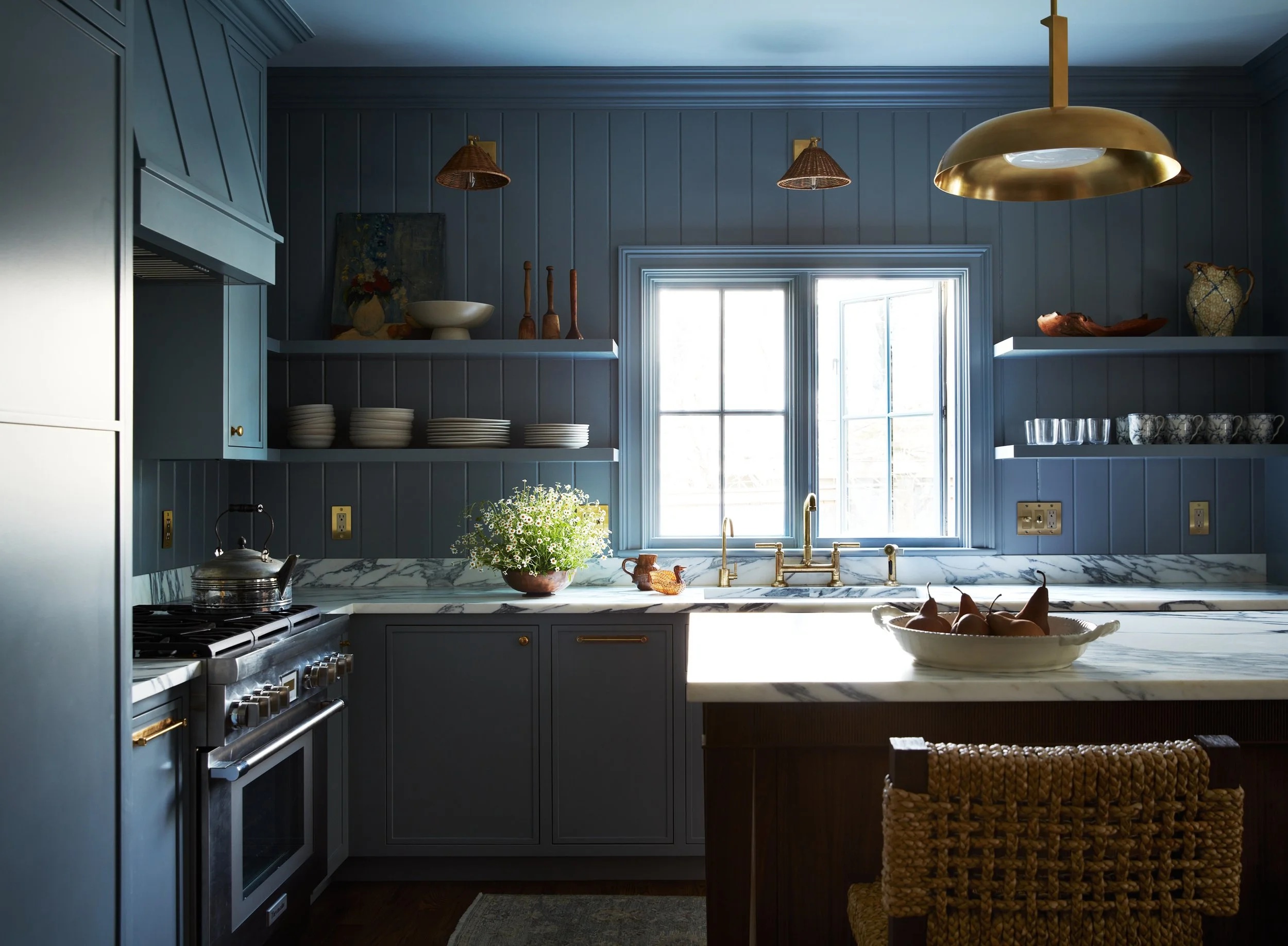
A Few of Duelle Made’s Go-To Blues
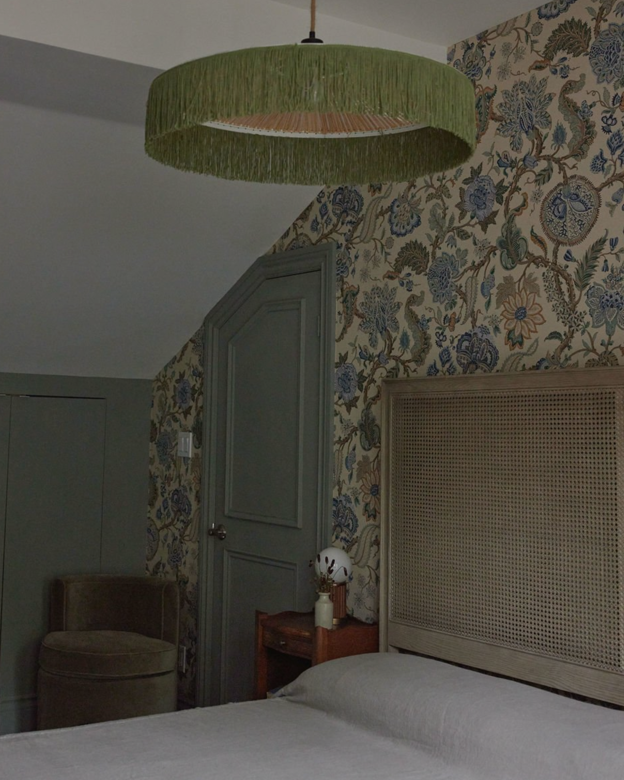
In Interior Design
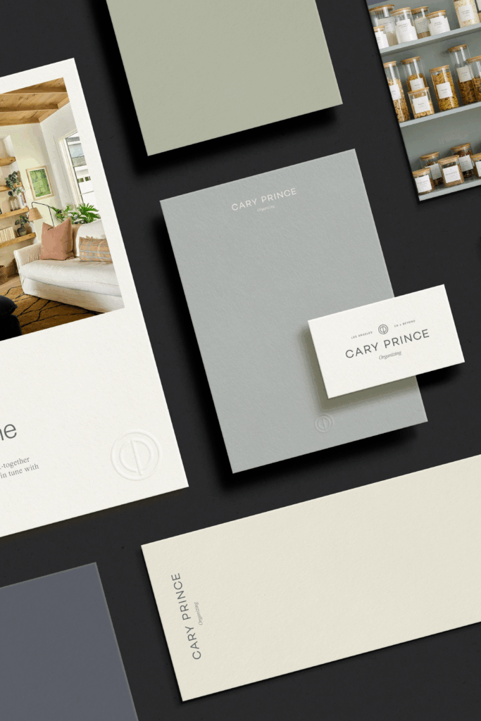
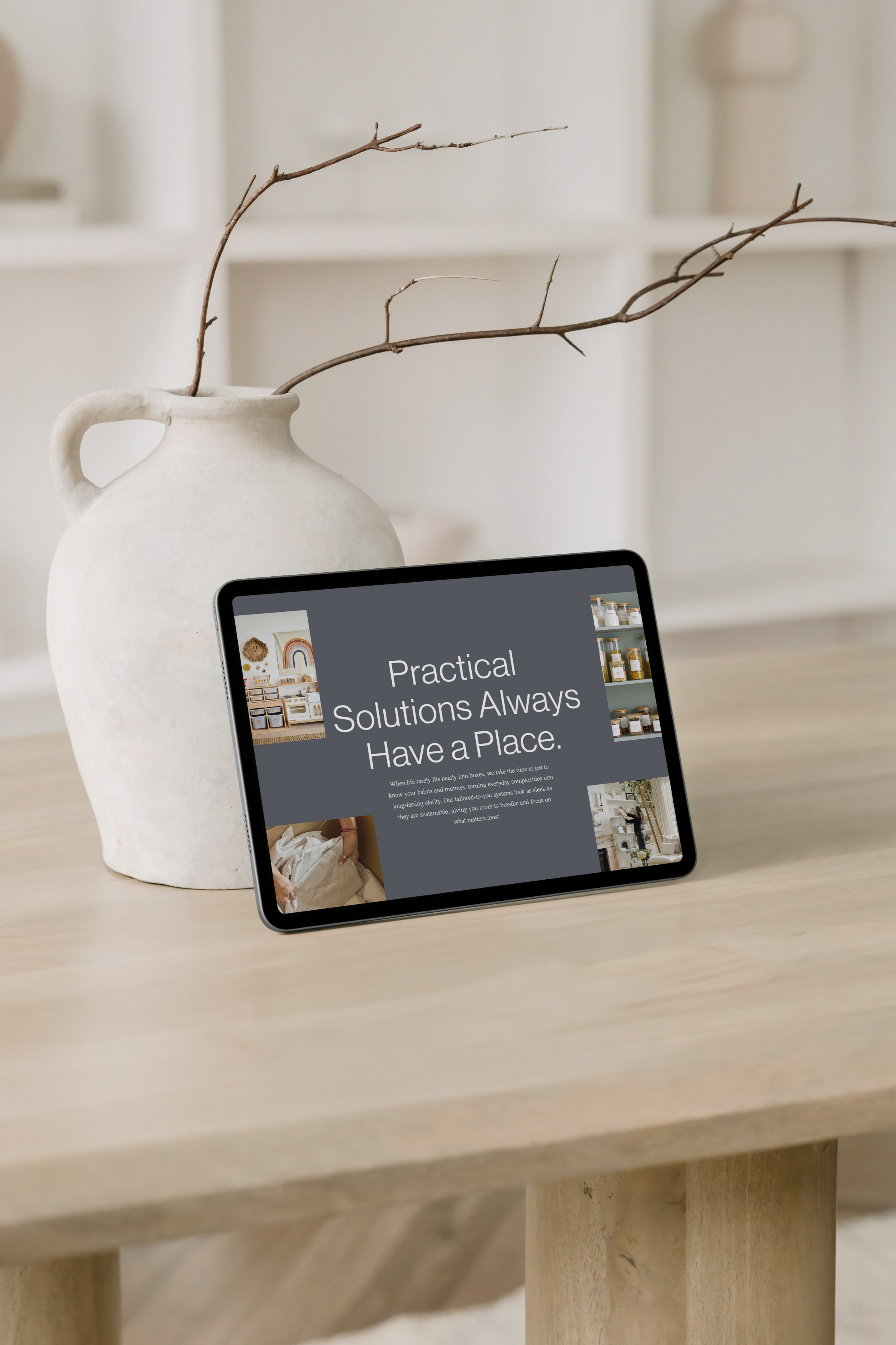
In Our Brands
Blue’s remarkable range keeps drawing us back at Duelle Made, even though our hearts typically belong to warmer, more earthy tones. When we collaborate with dynamic interior brands like Cary Prince Organizing and Maison Ellie Interiors, this colour’s chameleon-like nature pushes creative boundaries while staying true to a client’s refined vision.
Cary Prince Organizing: The brand’s colour palette is composed of neutral, muted, and warm tones, providing a clean, calming foundation that inspires feelings of hope, creativity, and confidence. Blue’s inherent sense of clarity perfectly reflects Cary’s mission to bring order and calm to her clients’ homes.
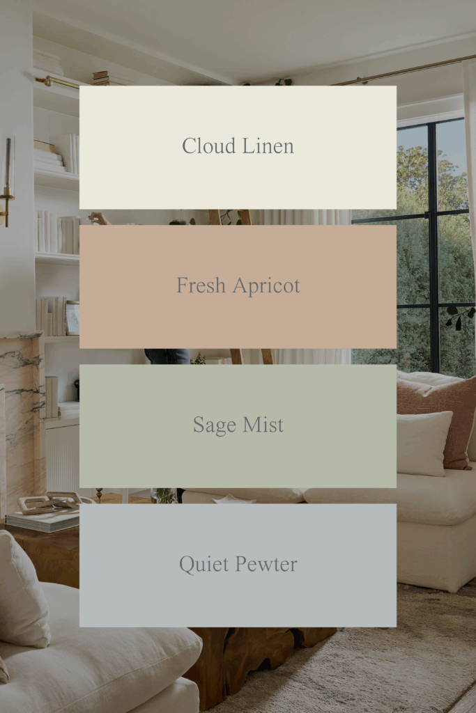
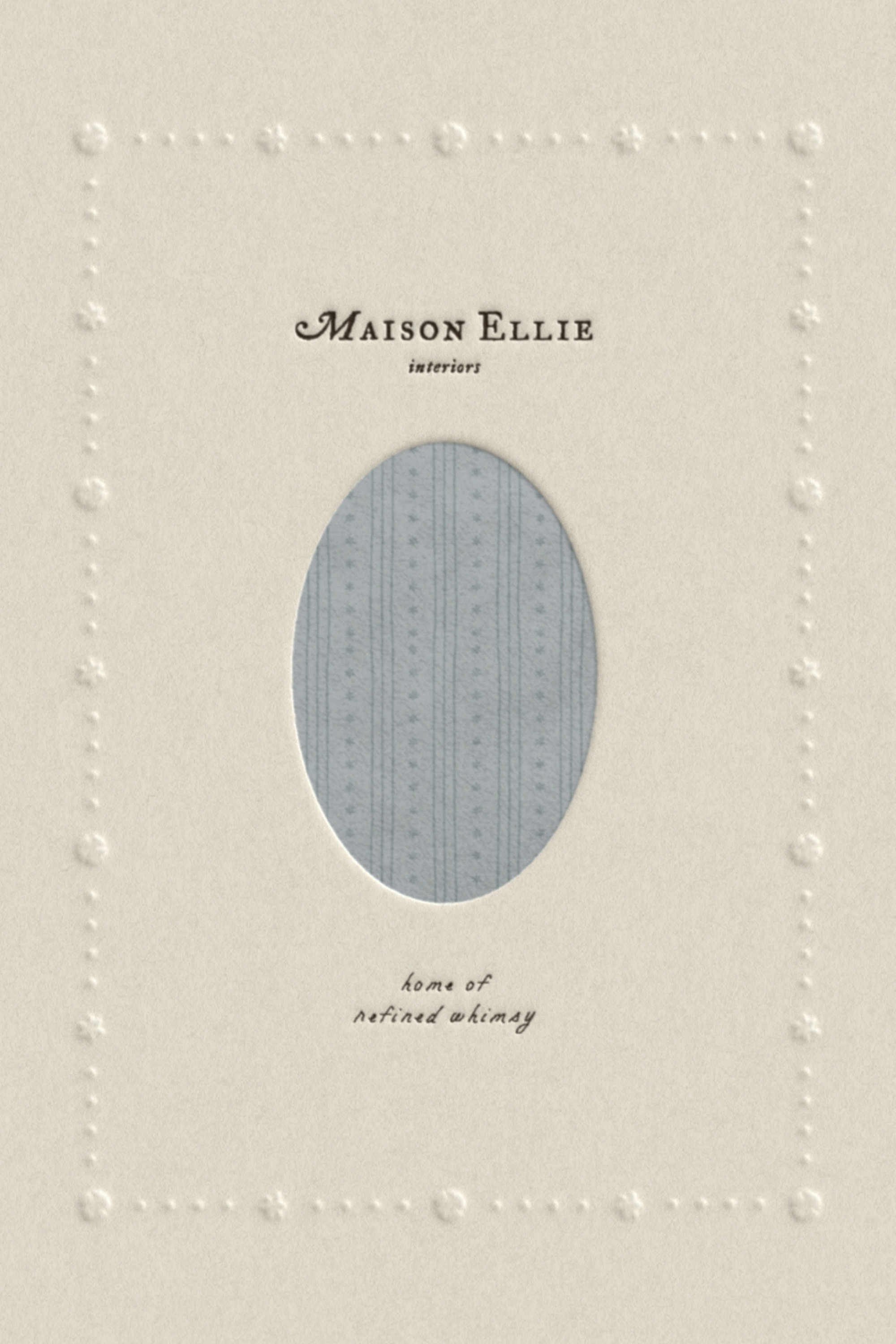
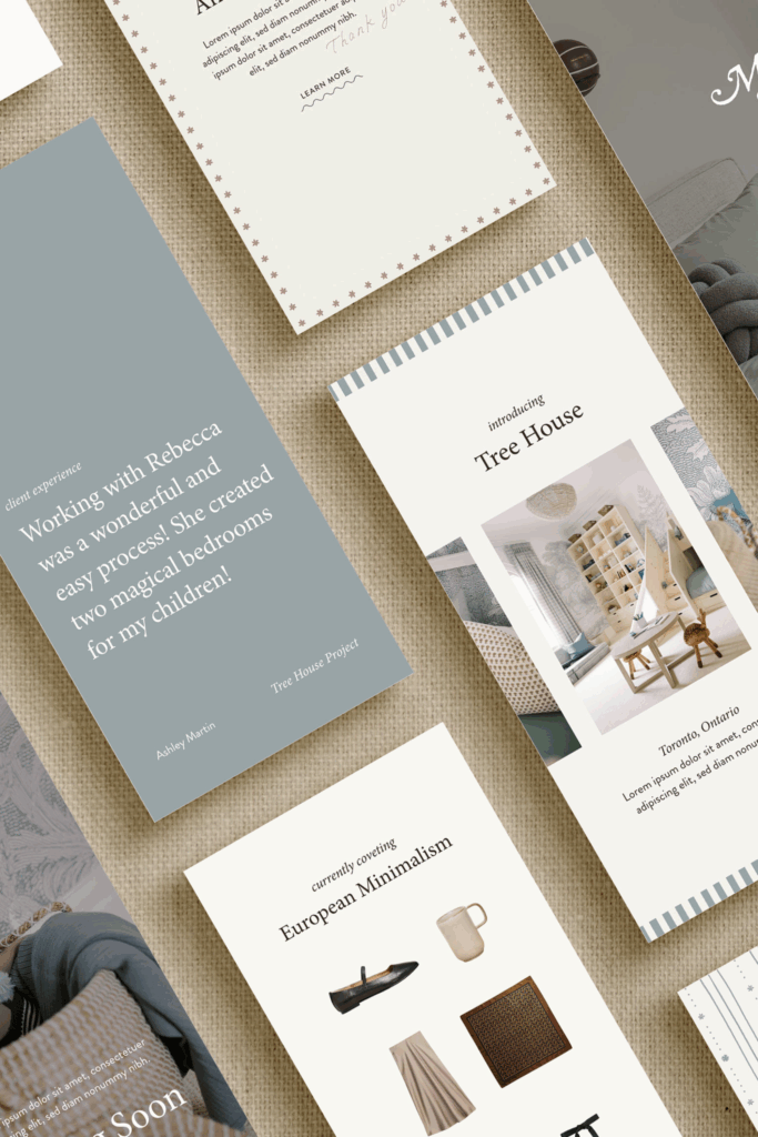
Maison Ellie Interiors: This colour story draws from nature’s most comforting tones – soft neutrals that feel both polished and playful. The pale blues bring peace, timelessness, and trust, creating the perfect foundation for a brand that designs for every stage of family life.
Next in Colour Conscious: We’ll explore the versatility and richness of red, from soft corals to deep crimsons. Follow along on Instagram @duellemade.