Welcome to “Colour Conscious,” our monthly deep dive into the colours that shape our surroundings. Together, we’ll explore how a single hue can transform spaces, define brands, and stir up emotions through thoughtful application and intentional design choices.
The Power of Pink
For our second edition, we’re drawn to pink – a colour that has this lovely way of bringing together different energies. It can be soft yet striking, playful yet sophisticated.
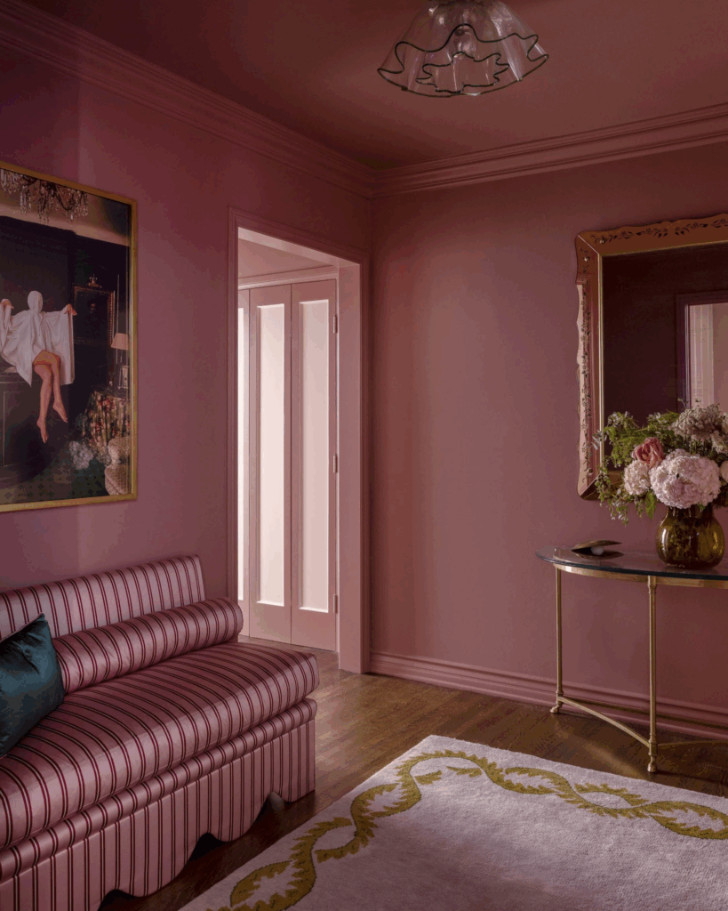
Whether it shows up as muted blush tones or confident magentas, pink carries an emotional richness that feels approachable yet dynamic. When used purposefully, it can awaken brands and homes, proving that pink is much more than simply “pretty” – it’s transformative.
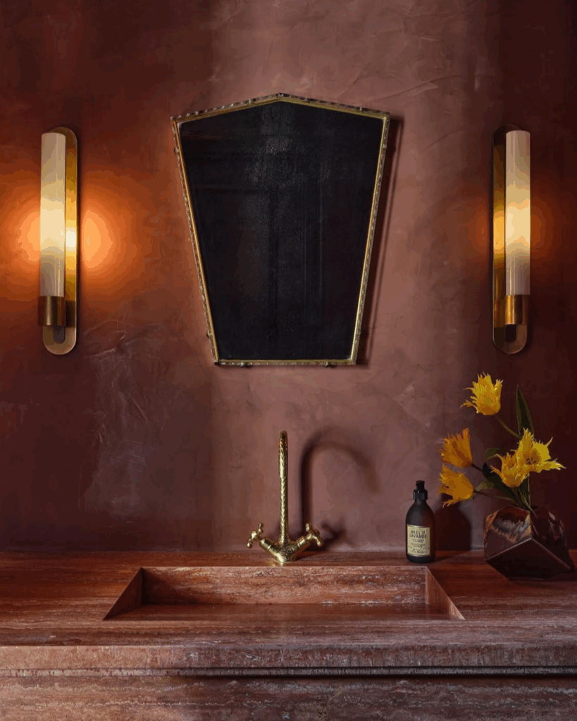
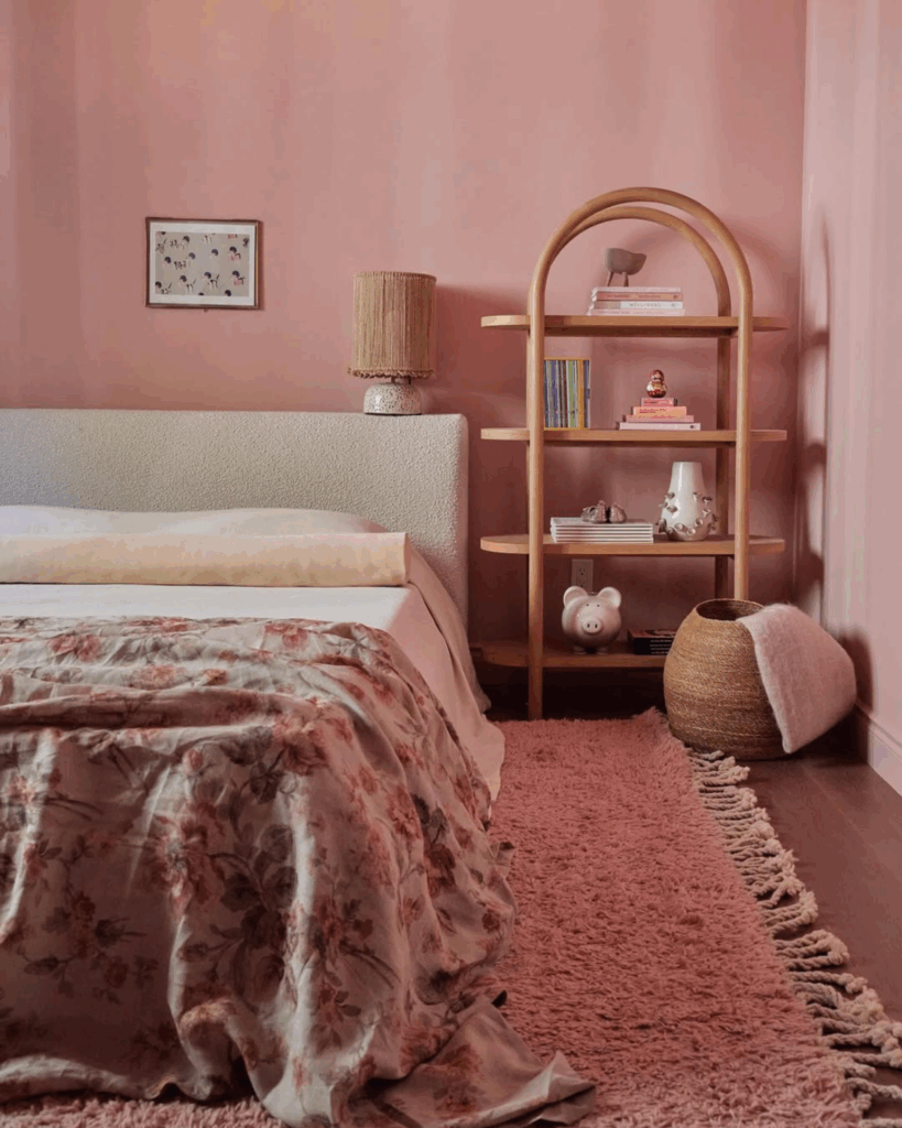
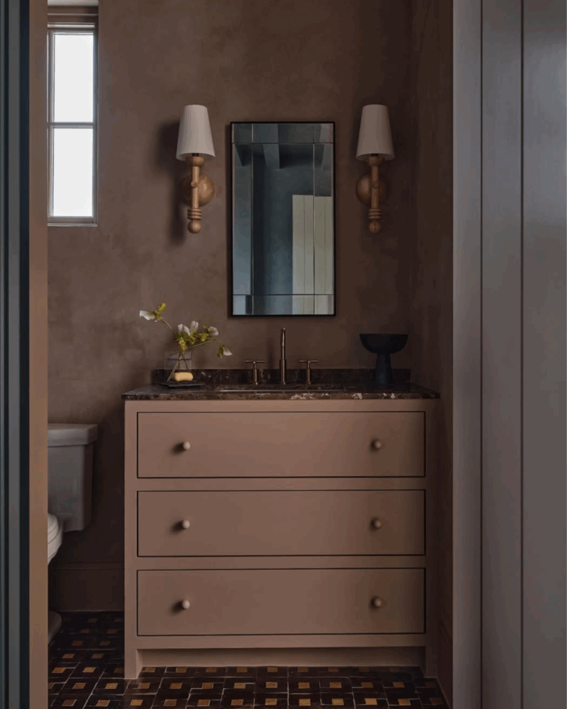
Pale roses and dusty pinks effortlessly support minimal, serene aesthetics, creating an atmosphere of gentle beauty where every element feels peaceful and balanced. In contrast, hot pinks and vibrant corals are natural scene-stealers, infusing spaces with warmth, excitement, and that delightful sense of drama that makes ordinary moments significant.For our second edition, we’re drawn to pink – a colour that has this lovely way of bringing together different energies. It can be soft yet striking, playful yet sophisticated.
A Few of Duelle Made’s Go-To Pinks
In Interior Design
In Our Brands
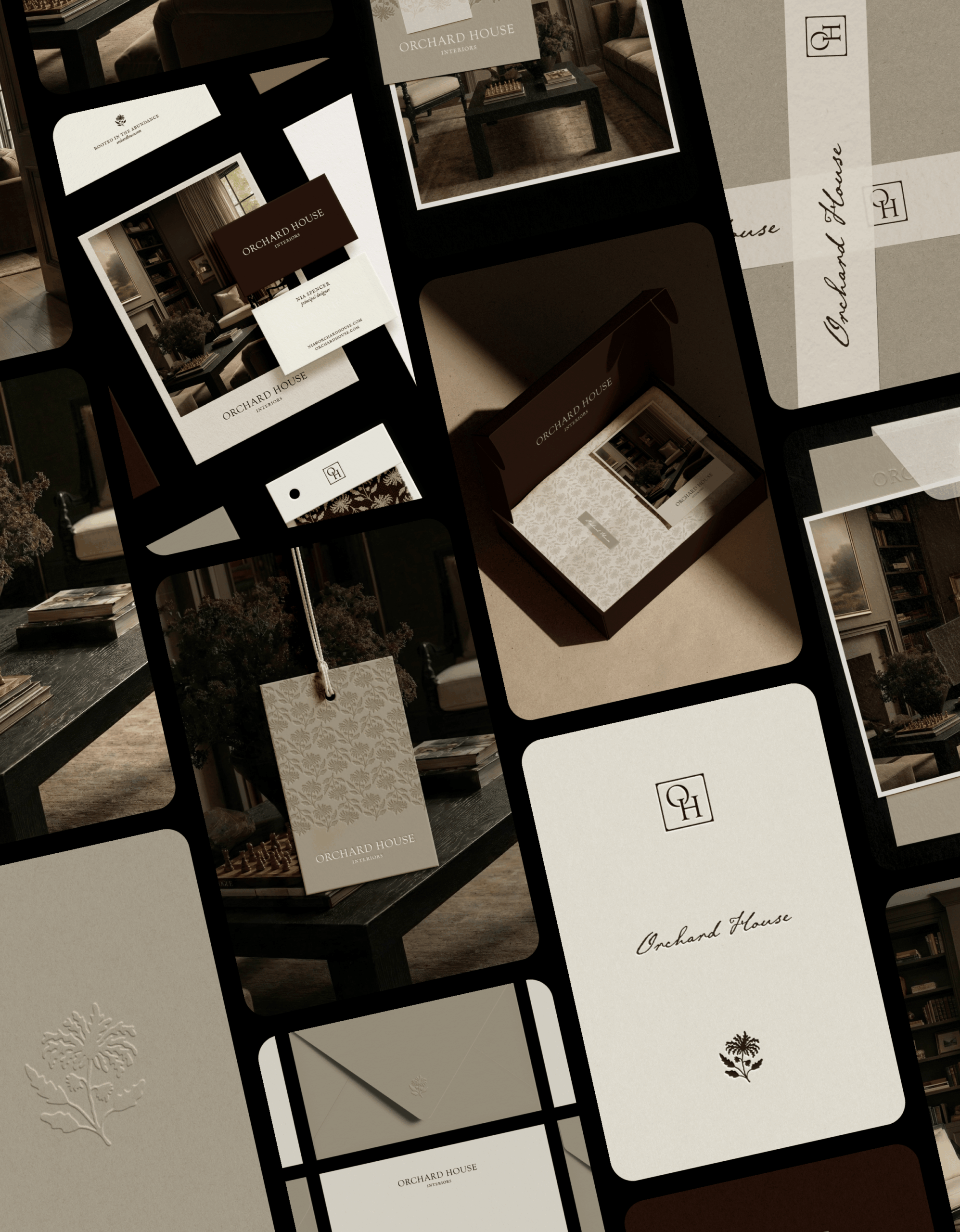
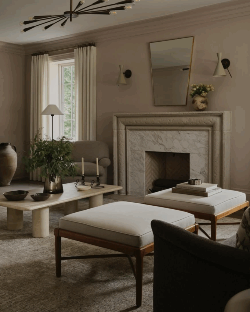
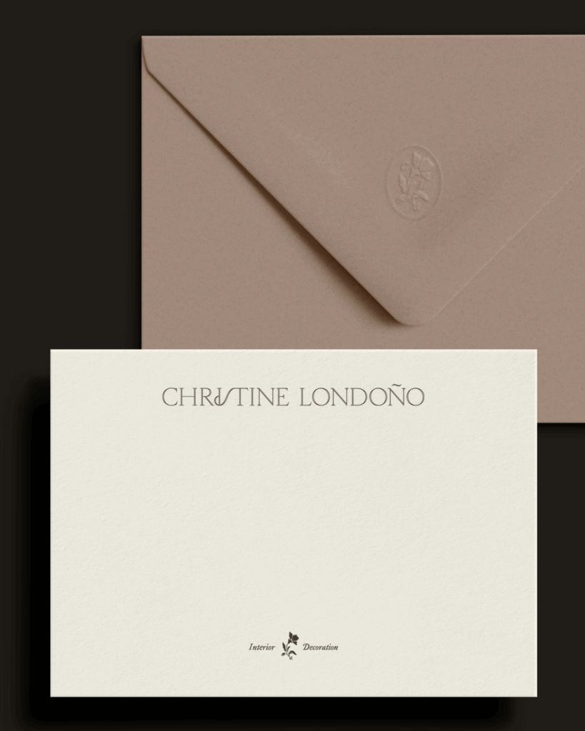
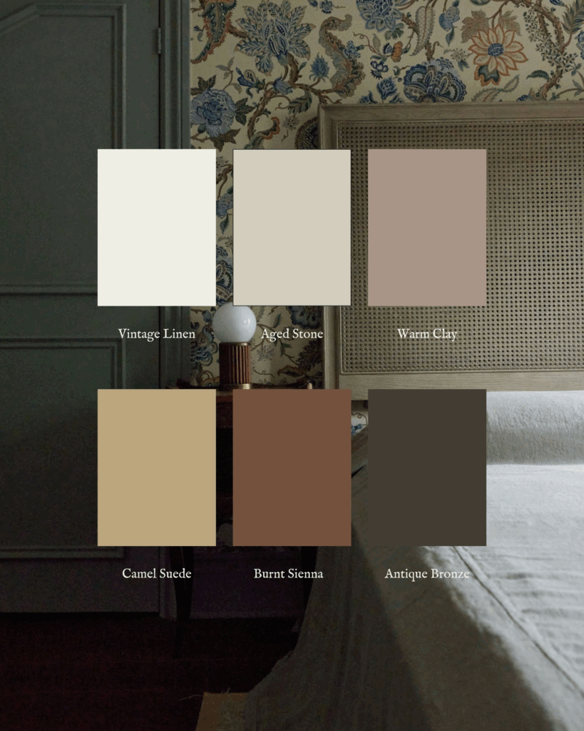
At Duelle Made, we tend to gravitate toward earthy palettes; still, we’re not shy about harnessing pink’s versatility – especially for the right client, like Christine Londoño Interiors.
This brand’s colour scheme draws inspiration from natural textures and curated interiors, featuring romantic, yet grounded tones that reflect Christine’s talent. Her visual identity now clearly complements the spaces she completes – ones that feel both cozy and exquisite; a true love letter to home.
Next month in “Colour Conscious,” we’ll explore the versatility and sophistication of blue – from soft powder blue to deep navy. Follow along on Instagram @duellemade.